The taste of coffee is varied. In color and appearance, however, all coffees are usually very similar - a dark brown, sometimes even black liquid in the cup. At first glance, less exciting (except for skillful latte art). But what if the taste of the coffee determined its color? This is not a far-fetched thought, because that's exactly what the "Coffee Taster's Flavour Wheel" already does - it gives each flavor a color. And would one now go even further and put these colors on a canvas? That's the idea the artist duo Coffeesthesia had with their "VIZUALISATION" project, which created some wonderful posters of little colorful flavor explosions. Let's take a closer look, though.
The colors of the Coffee Taster's Flavour Wheel
Different coffee institutions regularly publish a new state of their "Coffee Taster's Flavour Wheel". For example, the Specialty Coffee Association's (SCA) flavor wheel is based on the Sensory Dictionary of "World Coffee Research" (incidentally, its second edition was released last month).
The Coffee Taster's Flavour Wheel describes, in the form of a pie chart, many tastes that can be found in coffee. Each institution focuses on different flavors here. Our baristas often use Counter Culture Coffee's chart as well, which is less general and technical than the purpose-driven SCA chart. A quick comparison of Counter Culture Coffee and SCA shows that the former clearly targets a specific fruit/is more differentiated/fine-grained, while the SCA chart remains neutral in color, more general and comprehensive. Basically, the bright colors in the Counter Culture Coffee Wheel are adapted to the flavor object. Thus, chocolates are in a dark brown, while nuts and cereals are in a light brown. Fruits start with pink and eventually spread across the entire rainbow, depending on the variety. Vegetables are in the green color spectrum. The Counter Culture Coffee Wheel categorically lists certain foods whose flavors can be found in coffee. The assignment of colors basically results in bright colors being attributed to a fruity coffee; fruits are mainly assigned red and pink tones. Floral notes tend to have yellow colors. Berry notes move in the blue color spectrum. A coffee with chocolate notes would then actually be beige, light or medium brown on paper. The colors immediately tempt us to imagine a coffee in the spectrum of colors.
So what does this look like - coffee on canvas?
Coffeesthesia set out earlier this year to paint the flavor variations of different coffees. Some of the results can be seen on the Instagram account, including our Kagumoini AA from Nyeri, Kenya. The Kagumoini shows dominant notes of blackberry, sweet vanilla and hibiscus on the finish. The body is rich and jammy, and that's how it shows up painted: a turquoise-blue-purple creature with white semicircles shows up on pink to light purple. It has isolated light yellow sandy areas on its flanks. It even seems to be in motion with its magenta-glowing wings. And suddenly, the Kagumoini isn't just lush brown at all. One comment below the image even describes it as "plum, magic and unicorns." Unicorns don't exist on Coffee Taster's Flavours Wheel yet, but maybe they will in the 2018 version. Until then, Happy Brewing!
It says 5 stars but you cannot rate this abo at all. I'm dissapointed because I get same coffee again and again and I don't like it at all. Even cheapest Spig Blume roast mix is better. Sure maybe it's not my cup of tea but could you send just different once. I ordered cofee once in two weeks so it's not even very short time. I wouldn't recommend this abonemet.
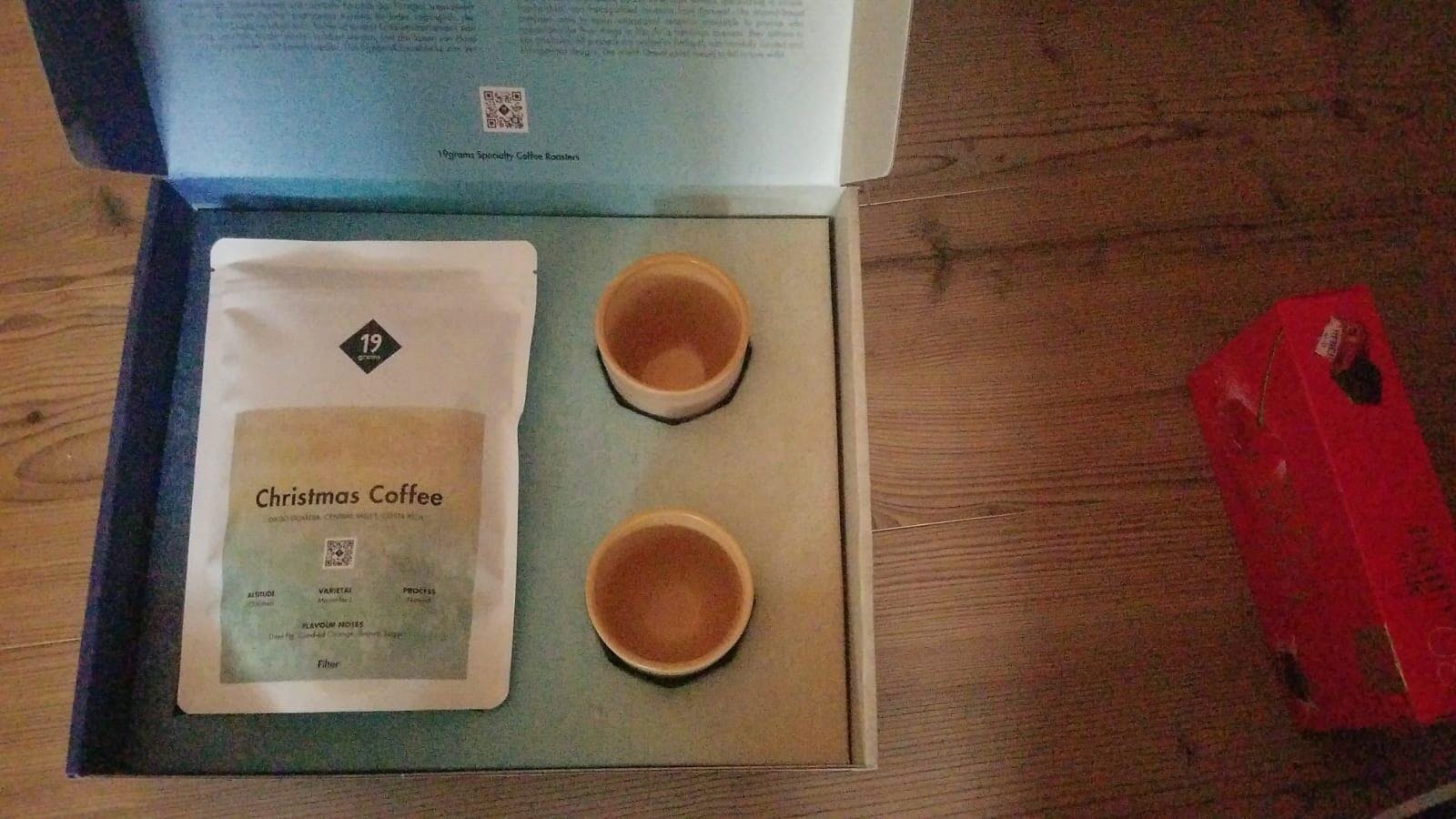
ich habe eine Box (knapp100€ mit 1,2kg Bohnen) als Geschenk bestellt
gesendet wurde eine Box für 50 € mit 250g Kaffee und 2 Tassen ...
ich warte aktuell noch auf Rückmeldung vom Kundenservice , den werde ich dann extra bewerten .
aufgrund des bestellverlaufs bisher kann ich absolut keine Empfehlung aussprechen!
So disappointing this year. We have ordered the advent calendar for years now (and paid for shipping to the US - that's how much we liked them) but this year was a complete disappointment. Many of the tins had stale beans in them - they even smelled staled right when opening them. Very few nuances and just plain boring coffees. There were a few highlights sprinkled throughout but nothing worth writing home about. Honestly, I am looking forward to returning to my regular coffee. I won't be ordering this calendar again next year sadly.
Dank anaerober Aufbereitung bietet der Kaffee ein üppiges Aromaspektrum, beginnend mit ausgeprägten Fruchtnoten und gefolgt von Schokoaromen. Für diesen Kaffee muss man sich - auch in der Zubereitung - etwas Zeit nehmen. Er ist definitiv kein Alltagskaffee. Dafür ist er auch zu hochpreisig.
Einfach WOW! Was für ein liebevoll und bis ins kleinste Detail gestalteter Adventskalender. Nicht nur der Kaffee kommt hier wie gewohnt in höchster Qualität, sondern das gesamte Design bzw. die Materialien des Adventskalenders sind sehr wertig und ein absoluter Hingucker! Besonders geschätzt habe ich bisher den Ablauf der "Kaffeereise" nach Regionen und die dazugehörigen, täglichen Infos über die Kaffees samt Regionen, Varietäten, Farmen, etc. Für mich definitiv mein Kaffee-Highlight des Jahres - und eine klare 10/10!